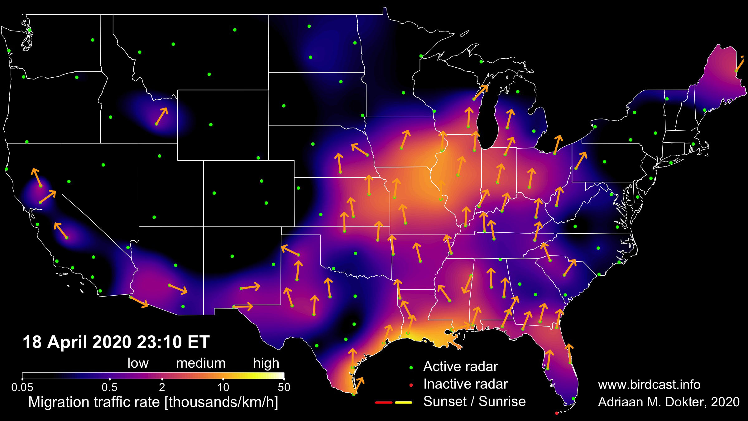
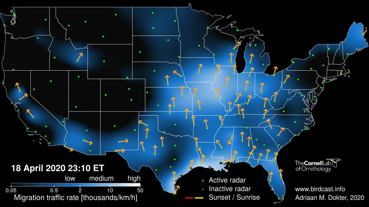
As of tonight, 20 April 2020, the BirdCast live migration maps will use the same color palette as the migration forecast maps on this site (as well as on https://aeroecolab.com/uslights) . The new color palette is more suitable for viewers with green-, red-, or blue-color blindness, and is perceptually uniform in color and black-and-white (see this interesting talk by its designers on the science behind this so-called “viridis” color scale).
The same color scale for migration forecast and live migration maps will facilitate comparisons of predicted and observation migration intensities. However, please note the following caveats:
- Live migration maps show migration traffic rate (in birds/km/h). If you were to draw a line or transect of 1km on the ground (perpendicular to the direction of movements of the birds), this number tells you how many birds would cross this line per hour. The migration traffic rate depends upon the density of birds in the air and the ground speed at which they migrate.
- Forecasts show the predicted peak bird density (in birds/km²) at three hours after local sunset. If you were to draw a 1km x 1km square on the ground, this number tells you how many birds are aloft in the air column directly above the square, three hours after sunset. Unlike the migration traffic rate, the peak bird density does not depend upon birds’ ground speeds.
Thus, live migration and migration forecast maps depict different quantities, so these maps will not look identical – even for a perfect forecast!
Wishing you good, safe and socially distanced (!), birding by radar!
Team Birdcast